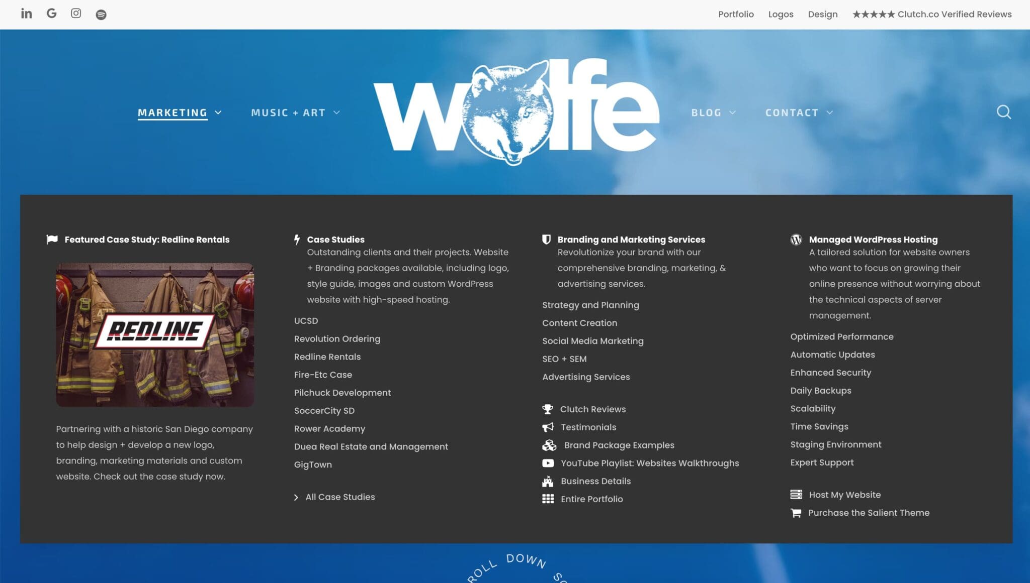
A fter years of using the Salient theme, I found the distinctions between the desktop menu and mobile menu a bit confusing. Understanding how to set them up is crucial for a seamless user experience. In this guide, I’ll outline the steps to create a a mobile-only menu for your WordPress site using the Salient theme.
Side Note:
As of June 2024, mobile devices account for 61.35% of all website traffic. This is up from 6.1% in 2011 and 37.2% in 2015. In the first quarter of 2023, mobile devices (excluding tablets) accounted for 58.33% of global website traffic.
Steps to Create a Mobile-Only Navigation Menu
A Mega Menu is too big for mobile devices.
Less is better for Mobile Menus.
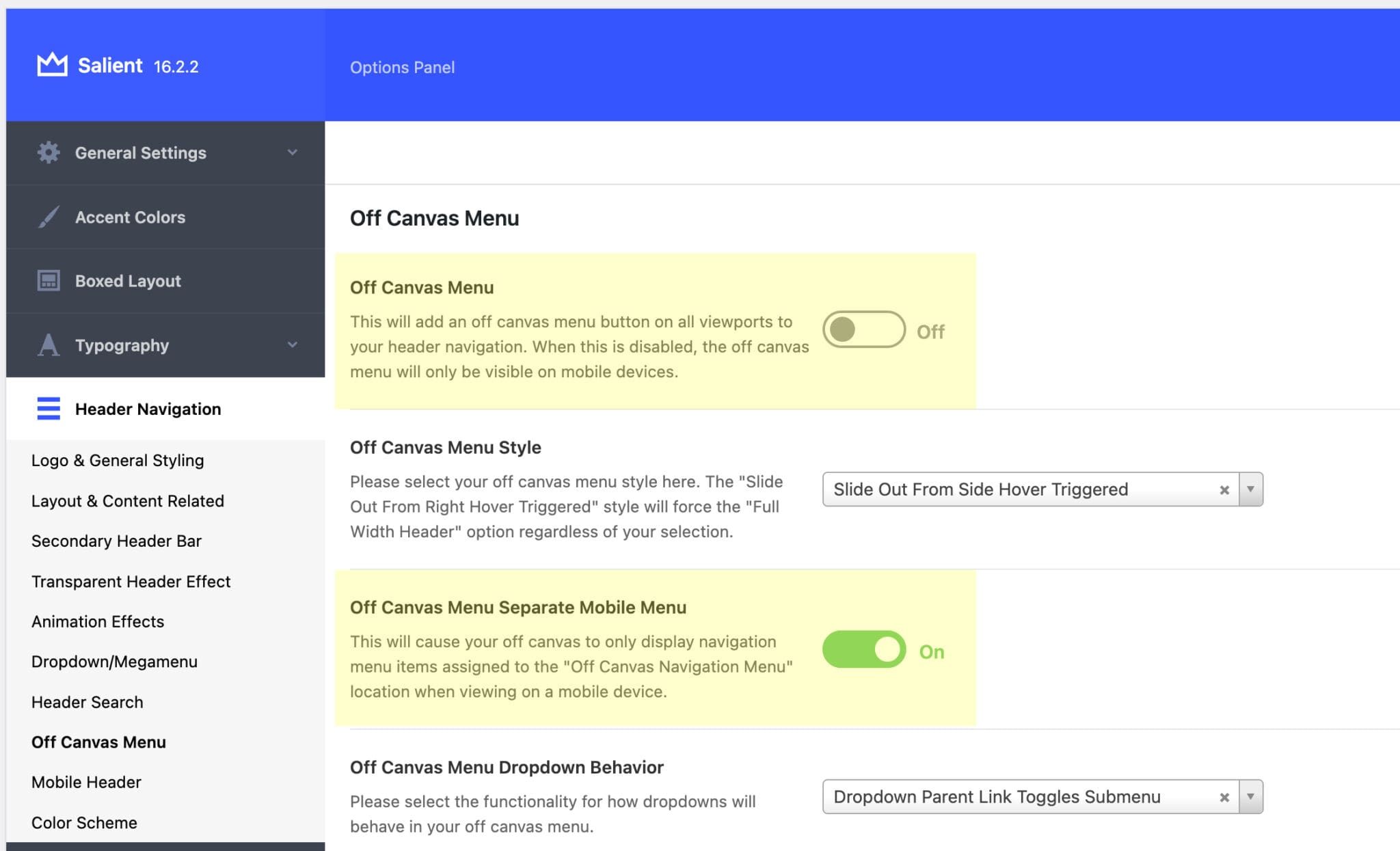
Step 1: Access the Salient Menu Settings
- Go to your WordPress dashboard.
- Navigate to the “Salient” menu.
- Select “Header Navigation.”
- Turn off the “Off Canvas Menu Toggle” switch.
- Ensure the “Separate Mobile Menu” option is turned on.
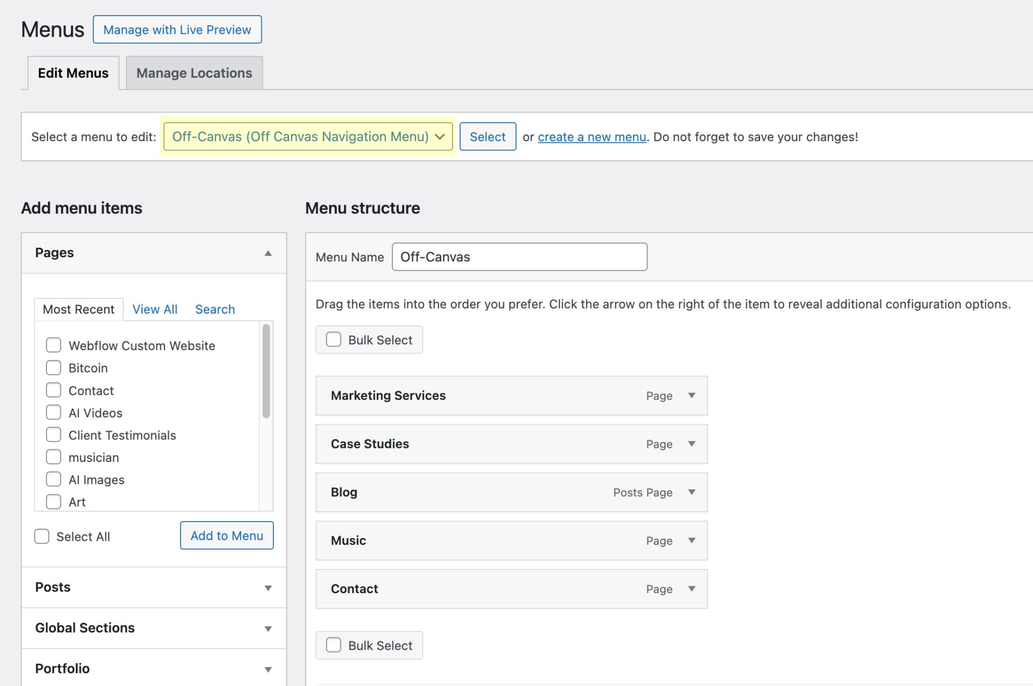
Step 2: Create a New Menu
- In the WordPress dashboard, go to “Appearance” > “Menus.”
- Click on “Create a New Menu” at the top right.
- Name your menu (e.g., “Off Canvas”).
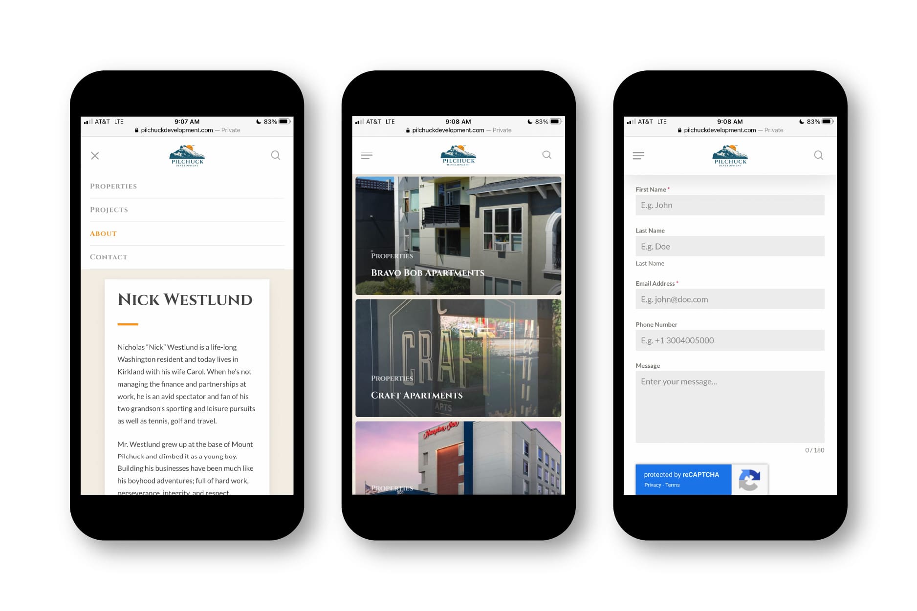
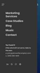
Step 3: Add Items to Your Mobile Menu
- Add the desired items to your new menu.
- Keep it simple, with only essential links and no sub-links to maintain a clean and user-friendly interface.
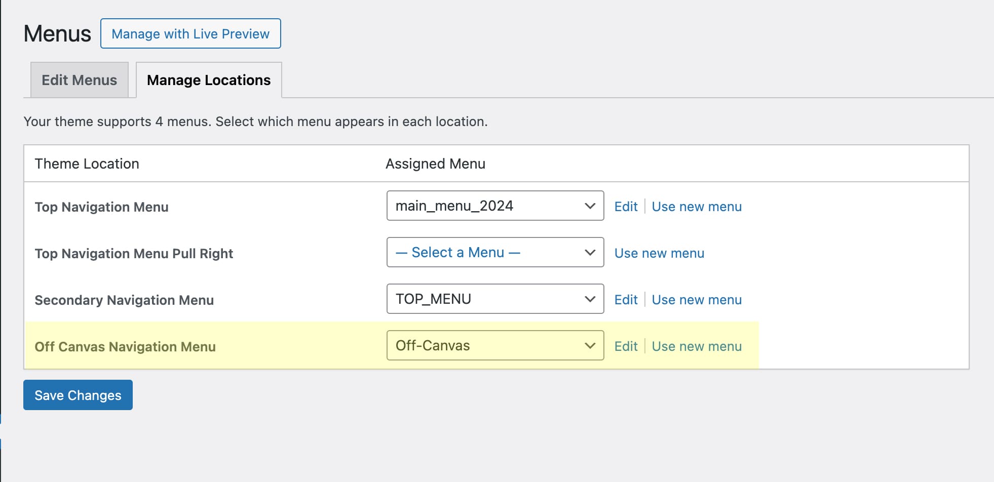
Step 4: Assign the Menu to the Mobile Navigation
- Go to “Manage Locations” in the Menu Manager.
- Under “Off Canvas Navigation Menu,” select your newly created menu (e.g., “Off Canvas”).
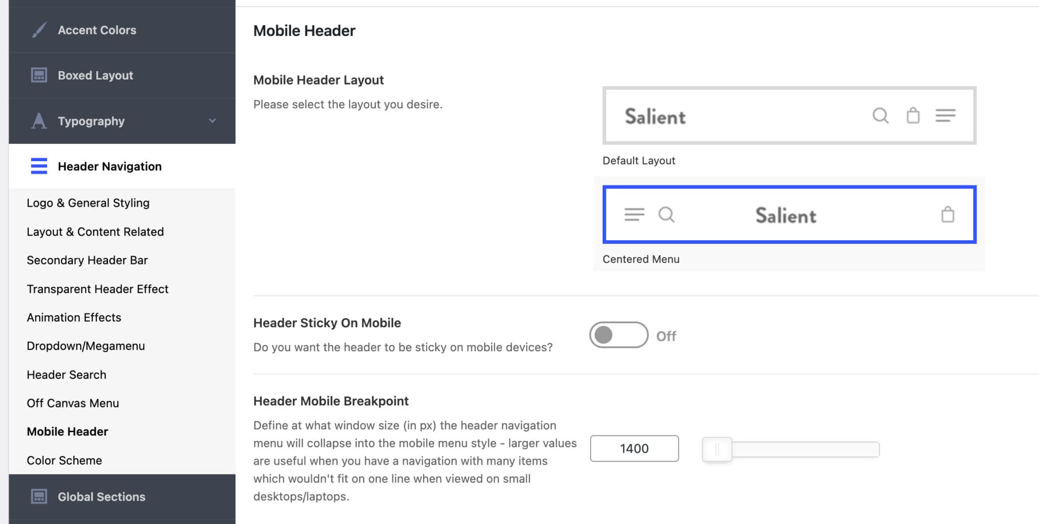
Step 5: Customize the Mobile Menu Appearance
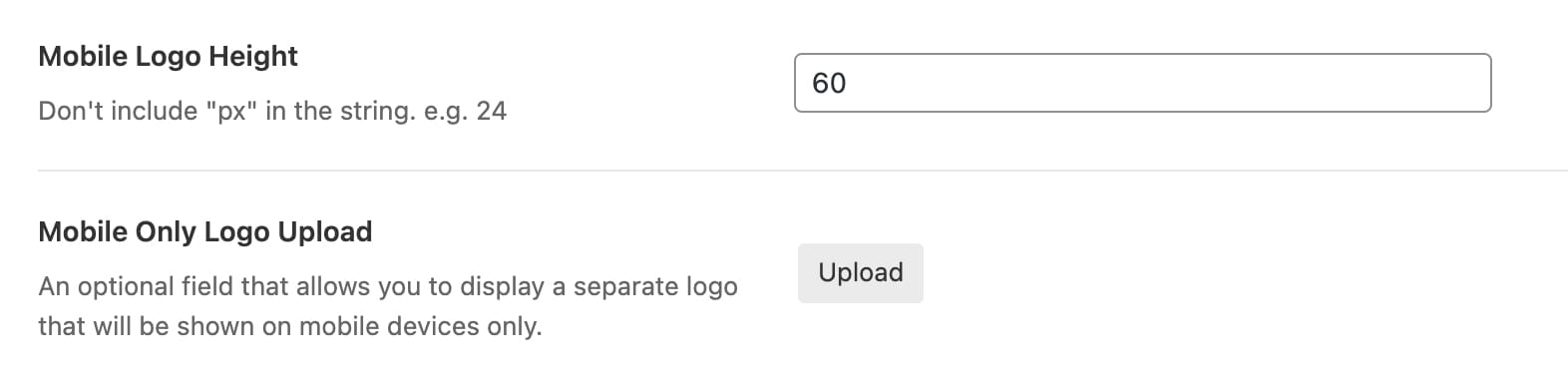
- In the “Salient” menu, go to “Header Navigation.”
- Customize the display of the logo and hamburger menu.
- If you have a logo that doesn’t scale well, create a simplified, horizontally oriented version for mobile.
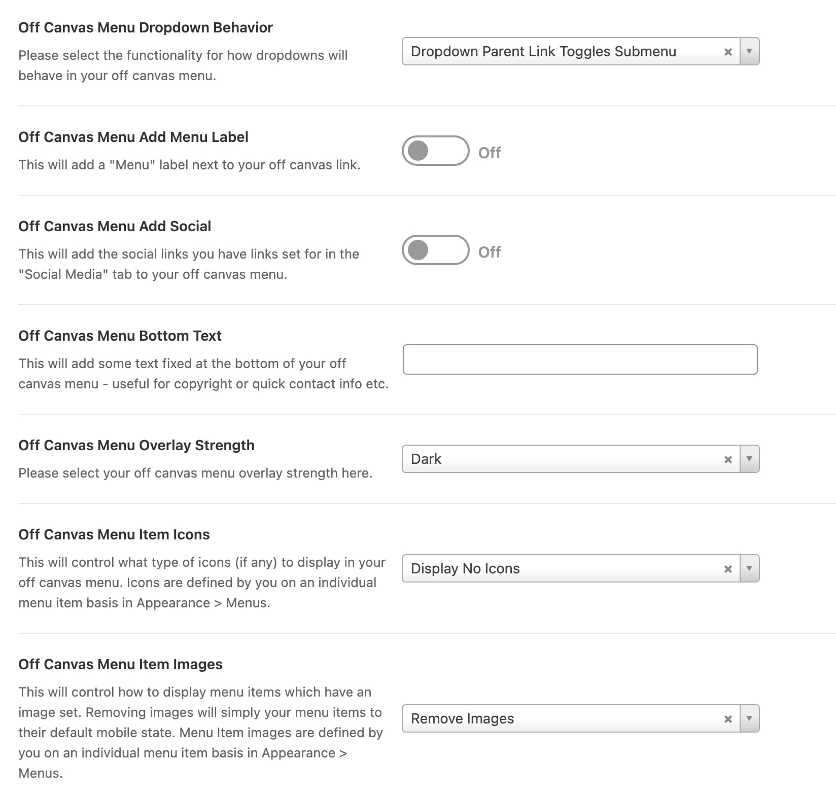
Step 6: Define Off Canvas Menu Behavior
- Experiment with the canvas behavior settings (e.g., slide-out options) to see what works best for your site.
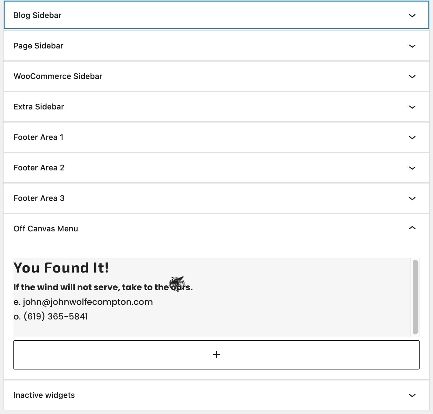
Step 7: Add Additional Content
- Go to “Appearance” > “Widgets.”
- Under “Widgets,” find the “Off Canvas Menu” section.
- Add a text block or other widget to include additional content like your email address and phone number.
C reating a distinct mobile menu for your WordPress site using the Salient theme ensures a better user experience on smaller devices. By following these steps, you can provide a streamlined navigation menu that enhances usability and accessibility for your visitors. Enjoy the process of customizing your site’s mobile navigation!