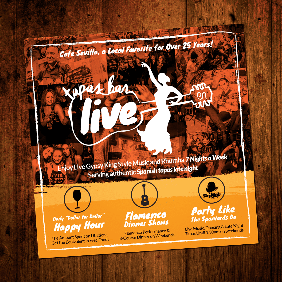
- Color Scheme: The dominant use of orange gives the design warmth and energy, aligning with the lively atmosphere of a tapas bar with live music. The contrast with the black and white elements ensures readability.
- Typography: The different fonts utilized seem to reflect the energetic and vibrant feel of the place. However, maintaining a more consistent typography might make the design feel more cohesive.
- Hierarchy: The main attraction, “Tapas Bar Live”, is effectively emphasized. The supporting information, such as “Enjoy Live Gypsy King Style Music” and the offers below, are presented in a descending order of importance.
- Graphics: The silhouette of the flamenco dancer with the guitar adds a touch of Spanish authenticity and is visually appealing. The use of real images in the background gives viewers a glimpse of the ambiance, although it might be slightly busy.
- Clarity: The main offers, like the “Daily ‘Dollar for Dollar’ Happy Hour” and “Flamenco Dinner Shows”, are clear and distinguishable. The icons used next to each offer are relevant and aid comprehension.
- Layout: The layout is dynamic and captures attention. However, some areas, like the photo collage in the background, might be too crowded, making it challenging to distinguish individual elements.
- Consistency: The rustic background complements the energetic atmosphere the design is trying to convey. It also harmonizes with the previous design we critiqued.
- Call to Action: While there’s a lot of information about what the venue offers, a direct call to action (e.g., “Join Us Tonight!”) might boost engagement.
- Fine Print: All the offers and details seem legible. The icons at the bottom provide quick visual cues about the services and features of the bar.
In summary, this design successfully communicates the lively and authentic vibe of Cafe Sevilla. Some refinement in the background images and typography could make it even more effective, but overall, it’s a dynamic and engaging visual.
- Flyer
